Football Canterbury
Why Football Canterbury Redesigned Their Branding
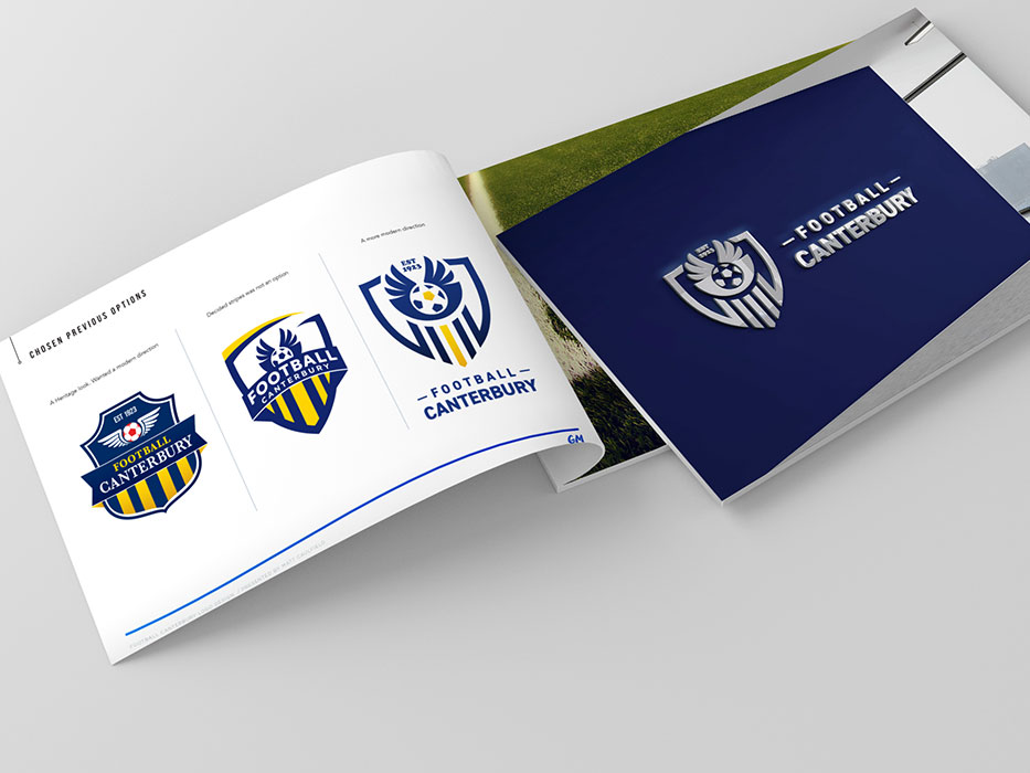
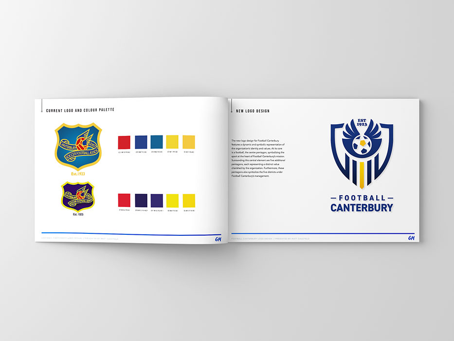
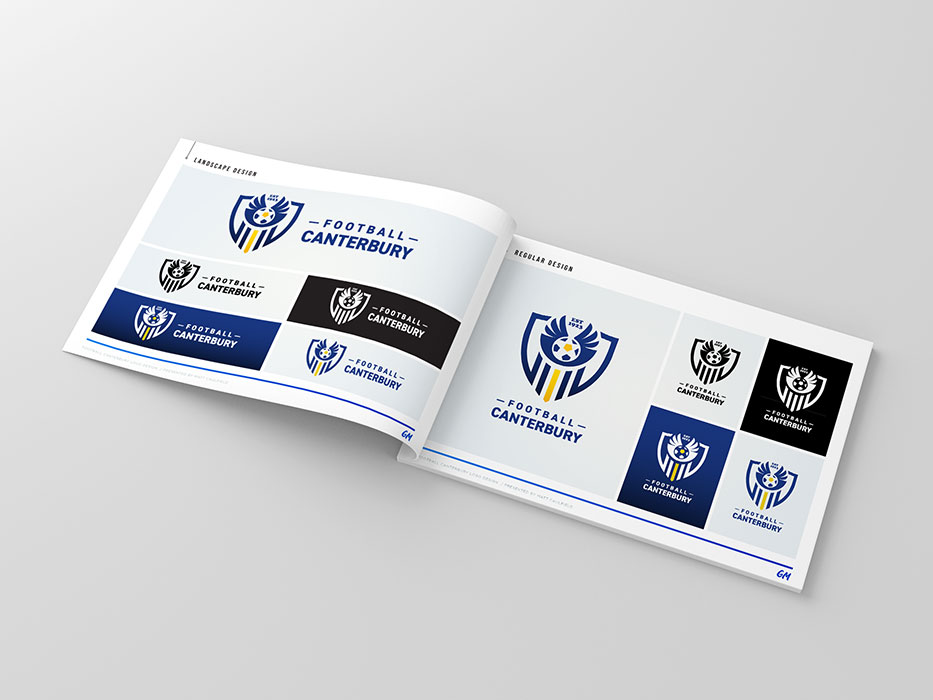
Background: Football Canterbury’s previous logo and branding no longer represented the modern identity of the organization. It was seen as outdated, inconsistent, and disconnected from the organization’s evolving mission and values. With the shift from Canterbury District Soccer Football Association to Football Canterbury, this rebranding presented an opportunity to respect the organization’s heritage while also moving forward with a fresh, unified, and forward-thinking identity.
The Goals Behind the Redesign
Respecting the Past: Historical elements such as the name, colors, and the year of establishment have always been key identifiers for Football Canterbury. These elements are deeply rooted in the community’s perception of the organization. Incorporating these symbols into the new design acknowledges and celebrates Football Canterbury’s legacy while embracing a more modern aesthetic.
Modernizing the Brand: The rebranding sought to change how Football Canterbury is perceived, emphasizing values such as inclusivity, fairness, leadership, and growth. The new logo was designed to:
- Reflect the organization’s commitment to being in touch with the community.
- Appeal to a diverse and multicultural audience.
- Convey the dedication, integrity, and strong foundation upon which Football Canterbury operates.
- Present a fresh and contemporary look that aligns with evolving trends.
The New Design: Key Elements
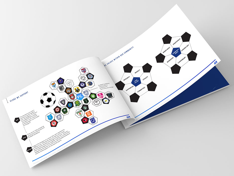
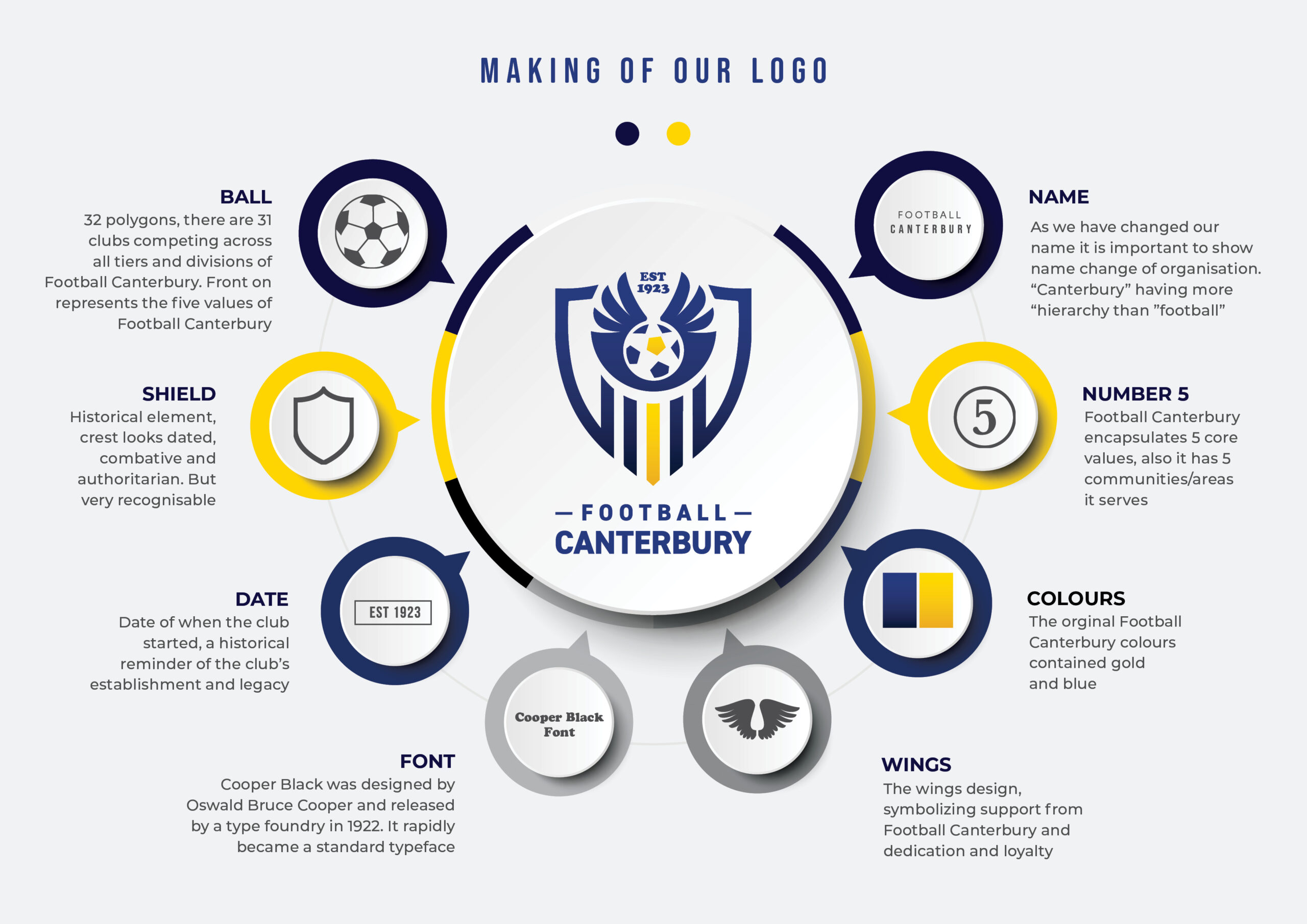
Ball: The ball in the logo features 32 polygons, representing the 31 clubs competing across all tiers and divisions, with the central polygon symbolizing Football Canterbury itself. The ball’s front-facing view reflects the five core values of Football Canterbury.
Shield
While the shield retains its historical roots, the updated design modernizes its appearance, transforming it from combative and authoritarian to a symbol of protection, unity, and strength.
Wings: The wings signify support, dedication, and loyalty, symbolizing Football Canterbury’s role as a guiding and supportive force for clubs and communities.
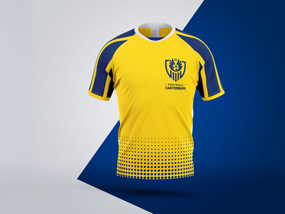
Colours: The gold and yellow stripes are the original Football Canterbury colours which they wanted to maintain.
Date: The inclusion of the establishment date serves as a reminder of Football Canterbury’s longstanding history and legacy.
Name: The name change is prominently displayed in the new logo to reflect the updated identity of the organization, ensuring recognition and alignment with its current vision.
Number 5: Five is a recurring motif in the design, representing the five core values of Football Canterbury as well as the five communities and areas it serves.
Font: The font selection, Monotype Baskerville Italic, was inspired by its popularity in 1923—a historical touch that aligns with Football Canterbury’s legacy while offering a timeless and sophisticated look.
The Impact of the Redesign
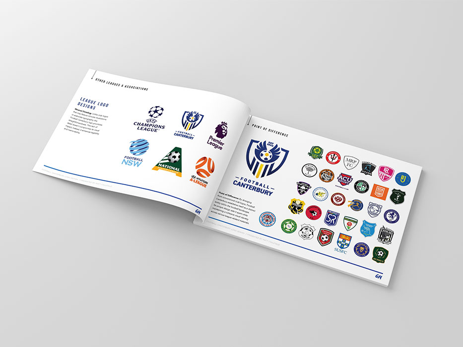
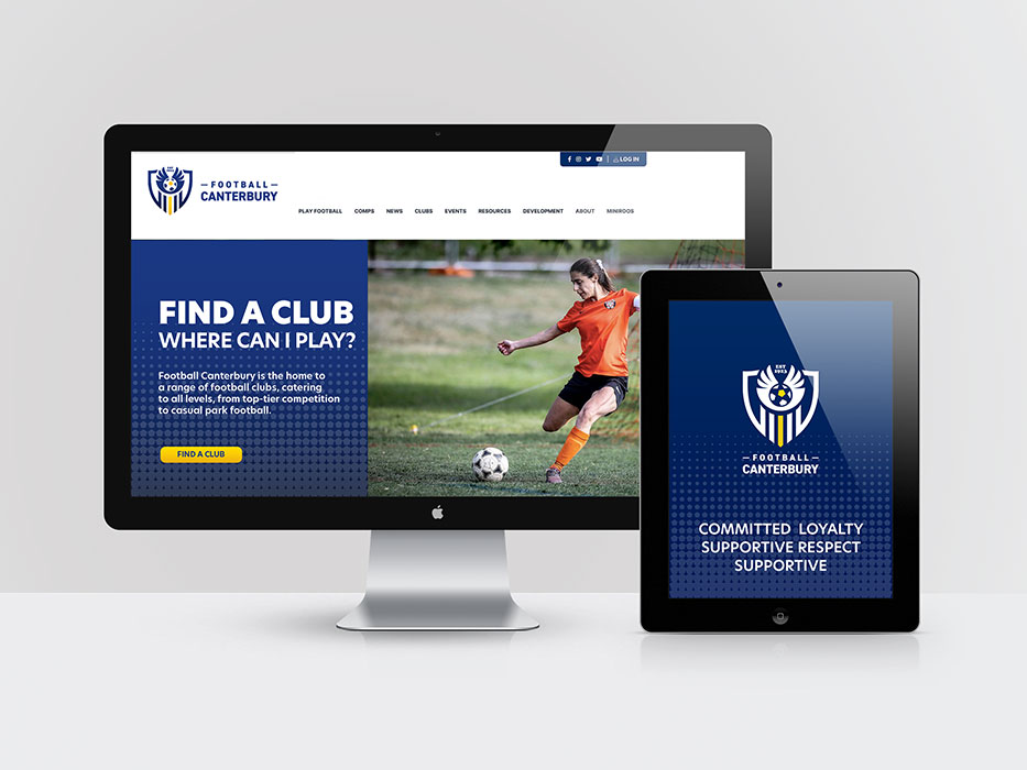
The redesigned branding successfully bridges the gap between Football Canterbury’s past and future. By integrating historical elements with modern design principles, the logo stands out among other football associations and leaves a lasting impression. The rebranding reinforces Football Canterbury’s position as an inclusive, competent, and forward-thinking organization dedicated to fostering community spirit and celebrating the sport of football.
This transformation not only enhances the visual identity but also reflects the values, mission, and aspirations of Football Canterbury, ensuring it remains a trusted and respected name in the region for years to come.
Design and approval are still in place with the client.
CLIENT
Football Canterbury
A member organisation of Football NSW
SERVICES
Brand Identity, Logo Development
YEAR
2024 -2025

